A Spice Brand Built for the Notes Cooks Make in the Margins
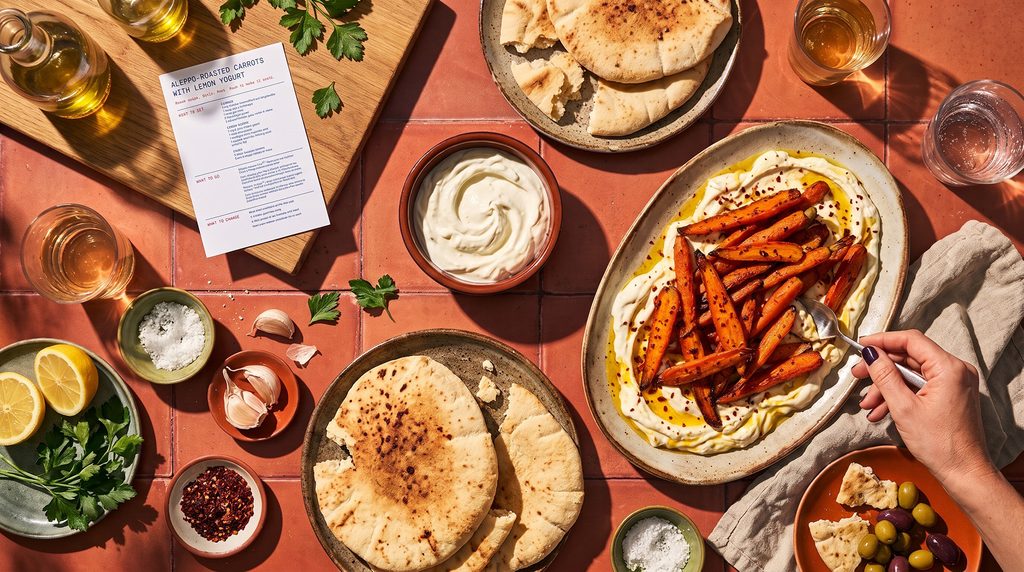
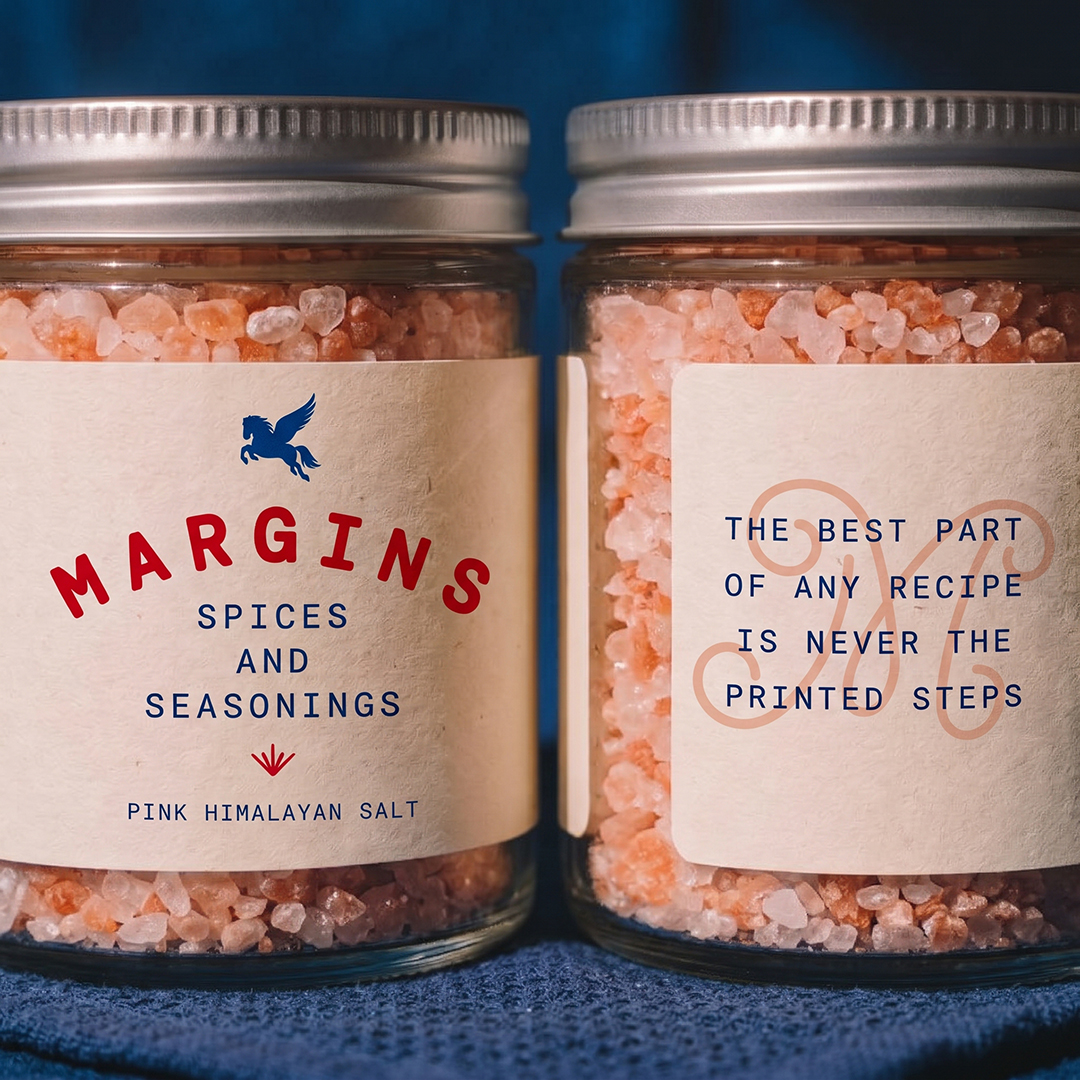
The best part of any recipe isn’t the printed steps. It’s the notes cooks scribble beside them: a pinch more heat, extra garlic, measure with your heart. Margins is a spice brand built around those notes. The blends are a starting point, and the goal is to make people comfortable bending them toward what they like, whether that’s spicy or mild, heavier on one spice or lighter on another.
- Client
- Margins
- Year
- 2025
- Role
- Art Director, Designer
- Industry
- Food & Beverage
- Services
- Brand Identity, Packaging Design
Brand Identity
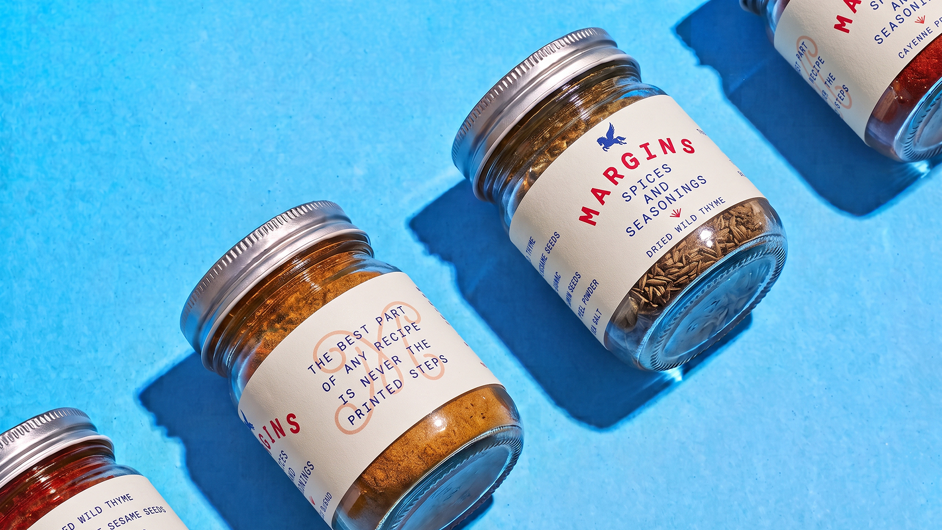
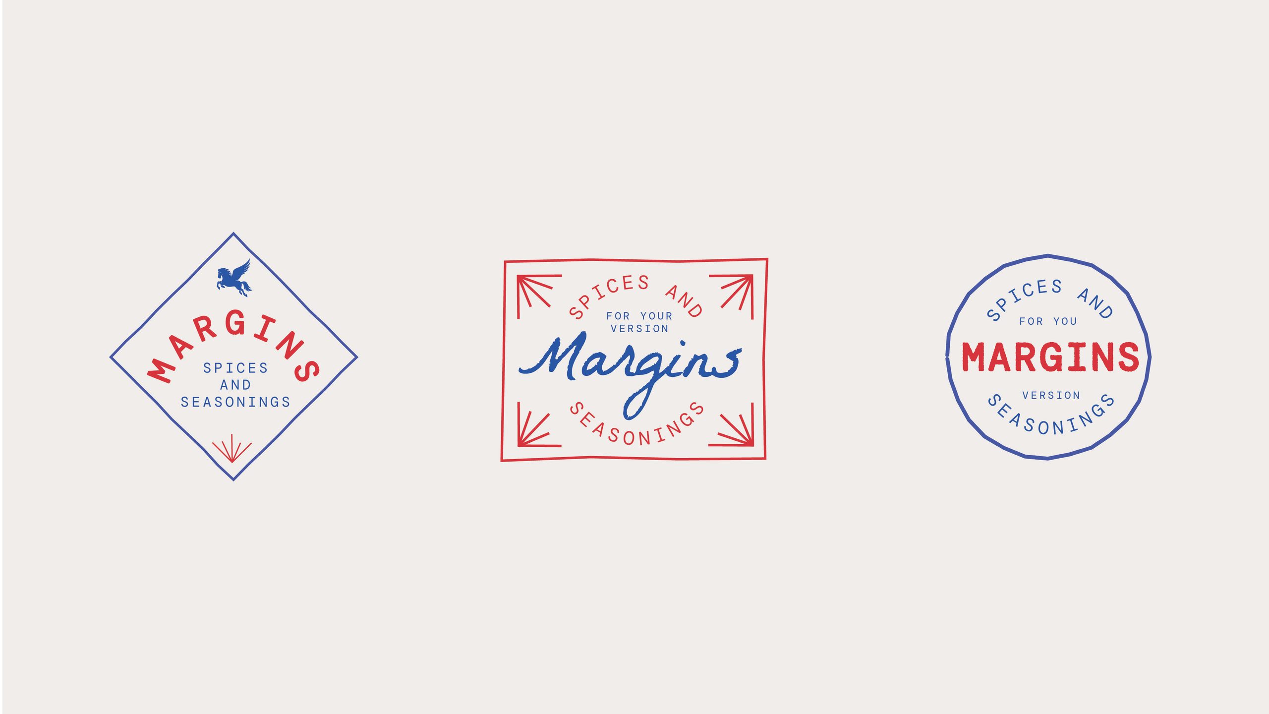
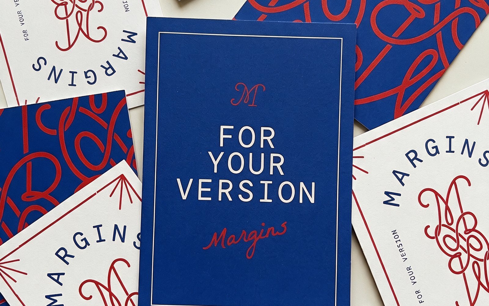
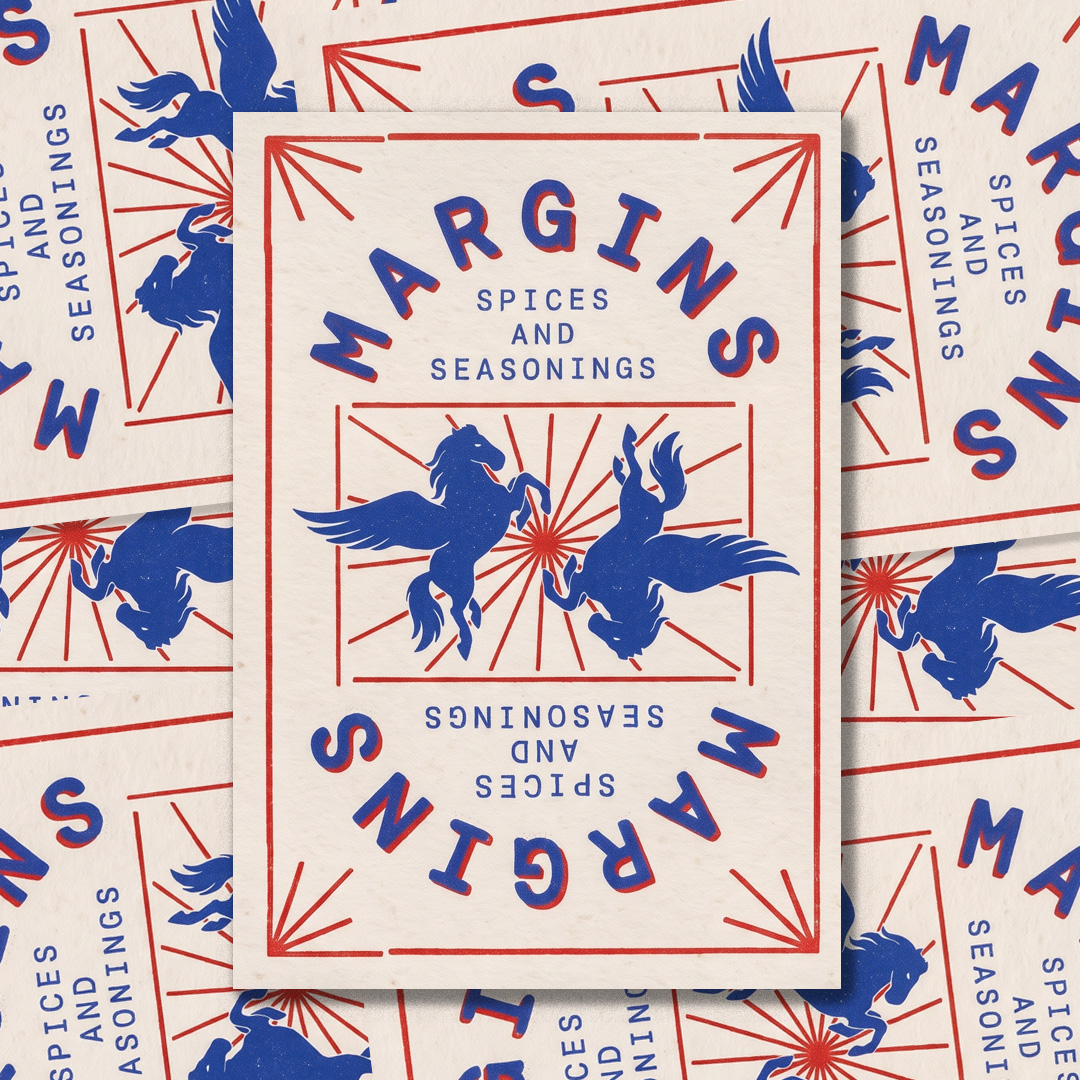
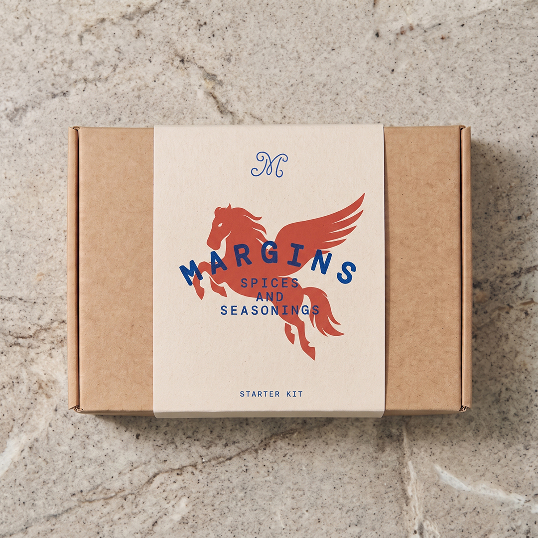
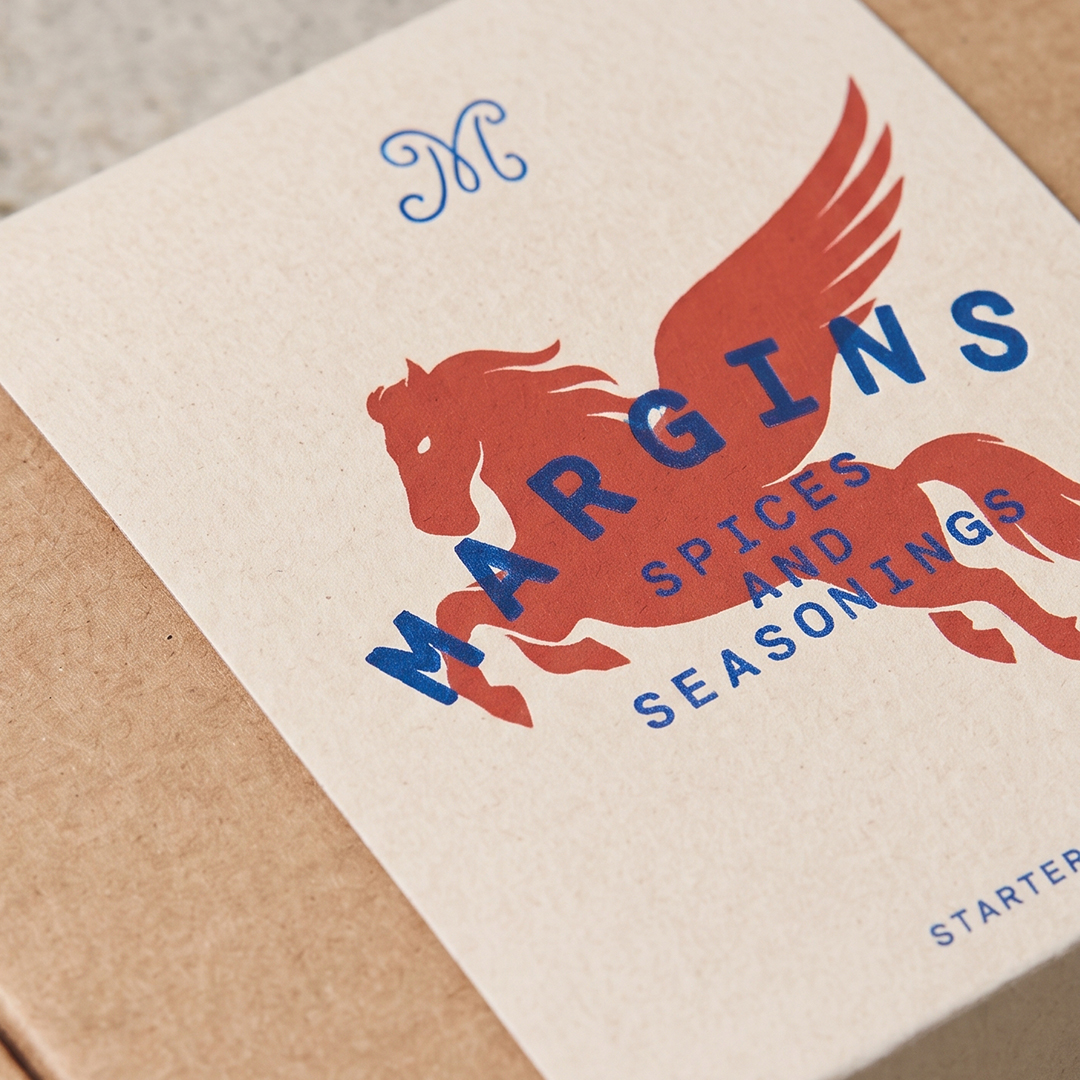
Margins is a system, not just a logo with a color palette, and it’s built to expand. Its core elements, a stamp, a monogram and a pattern, work as parts that combine, scale and reshape for each new blend, promotion or format.
The language is organic and hand-made, with lines that loosen and loop like a cook’s handwriting, so every application feels touched rather than stamped out. Vintage influences from historic spice-trade maps, nautical lettering and American roadside graphics give the system a sense of history while keeping it flexible enough to grow.

Packaging
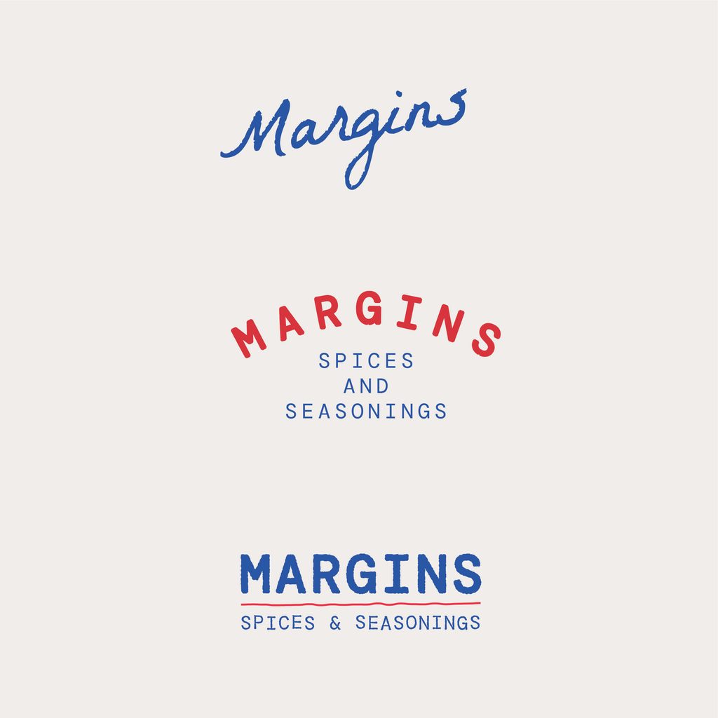
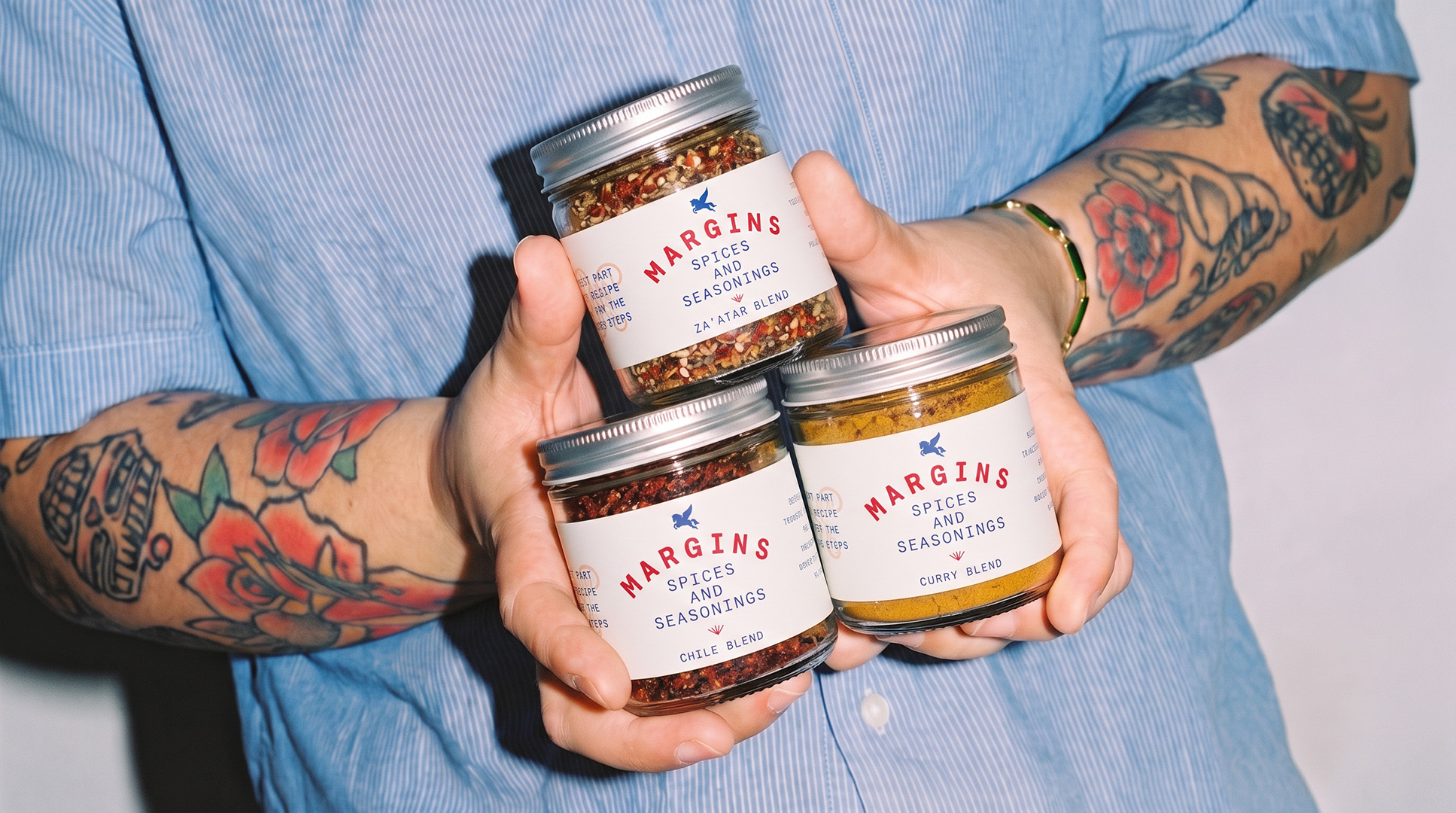
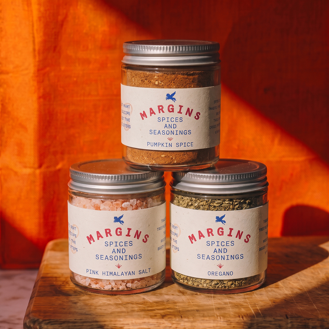
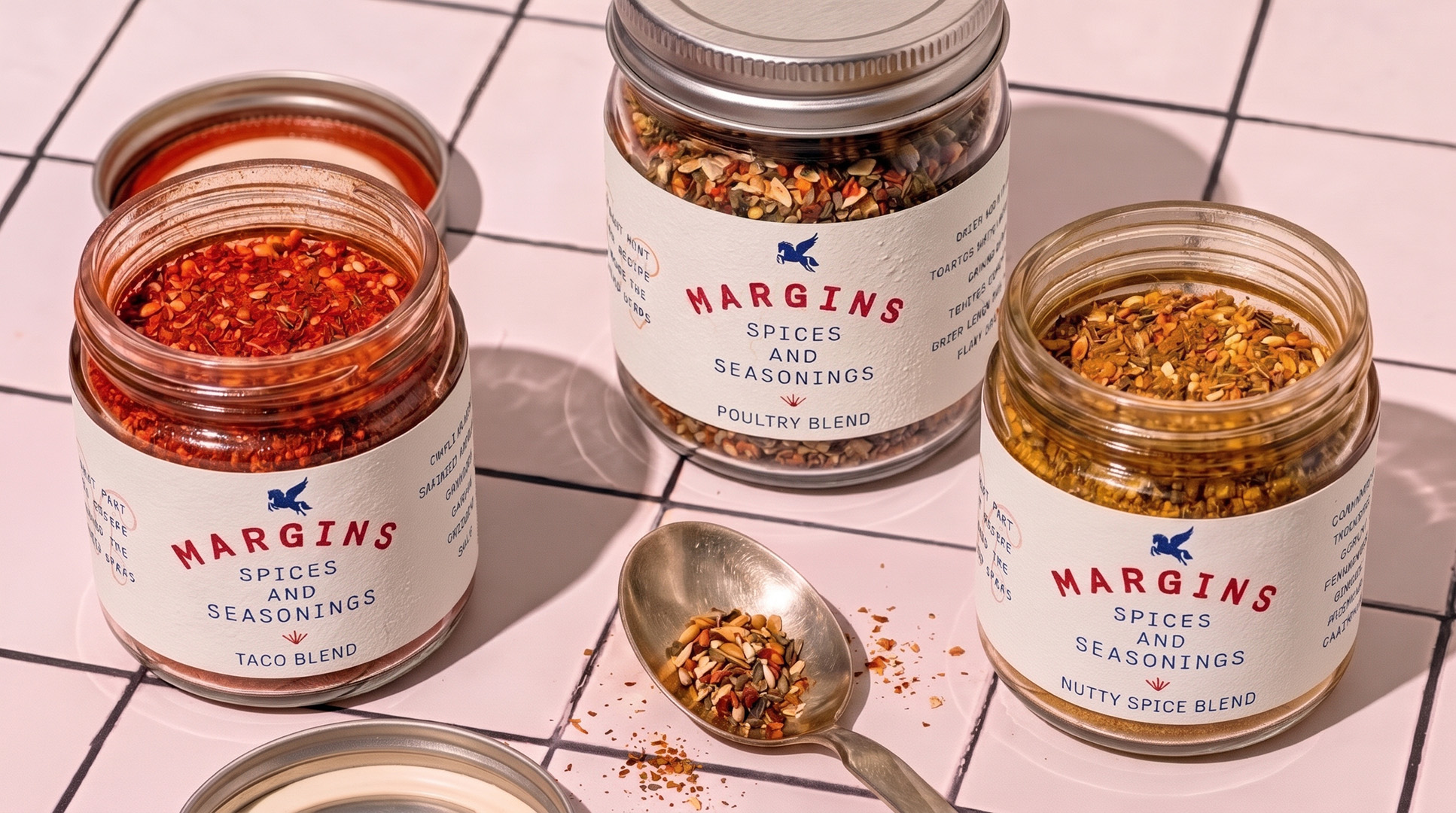
The label stays constant: arched wordmark, monospace descriptor and the monogram seal. Each blend brings its own color through the ingredient itself, so the shelf reads as one family with a lot of personality. Back labels list every ingredient in plain language, so cooks know exactly what they’re adding before they start adjusting.
Recipes & Notes
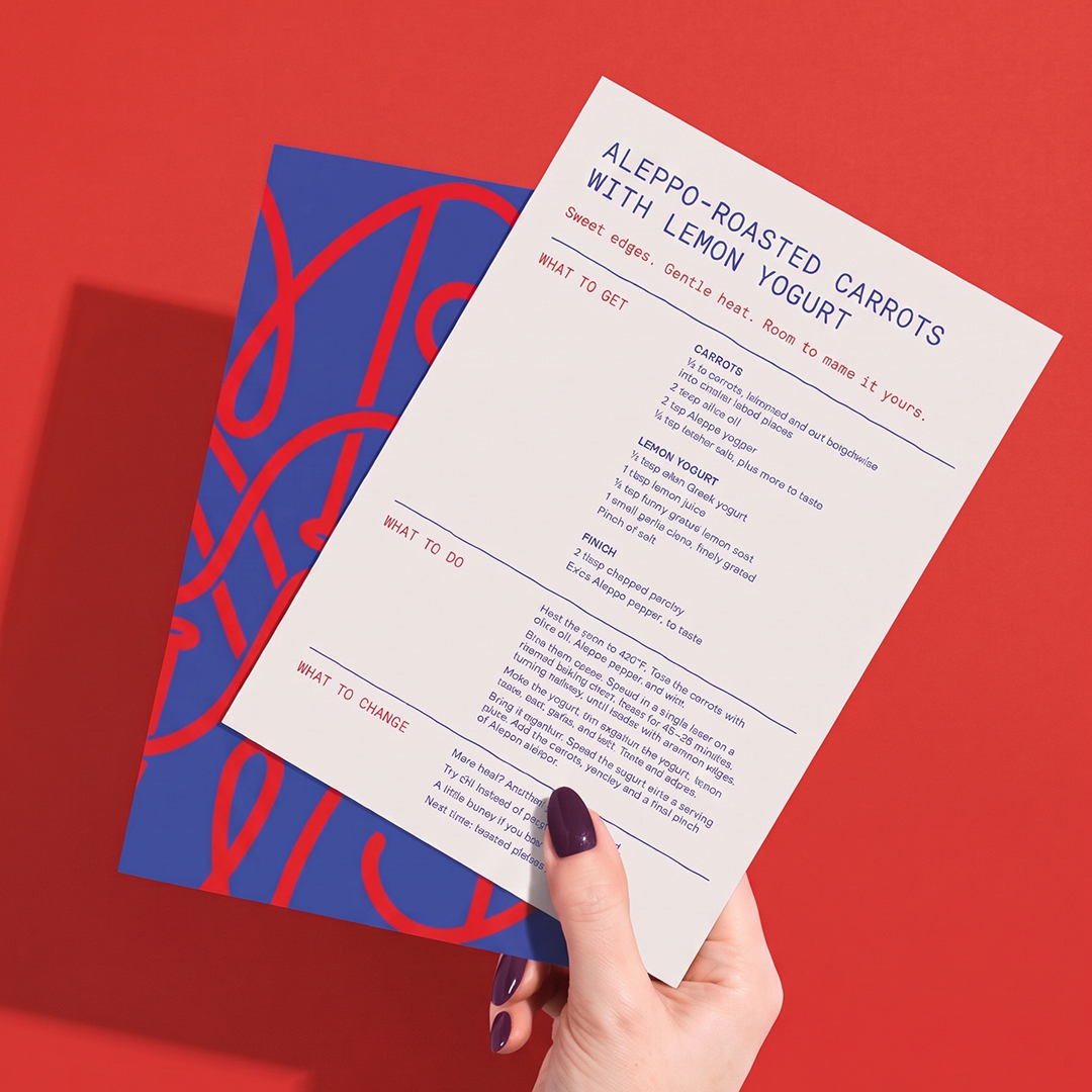
Recipe cards are built to be written on. Alongside what to get and what to do, each card suggests what to change, turning the brand line into a habit rather than a slogan.