The Flipside to Orange County California
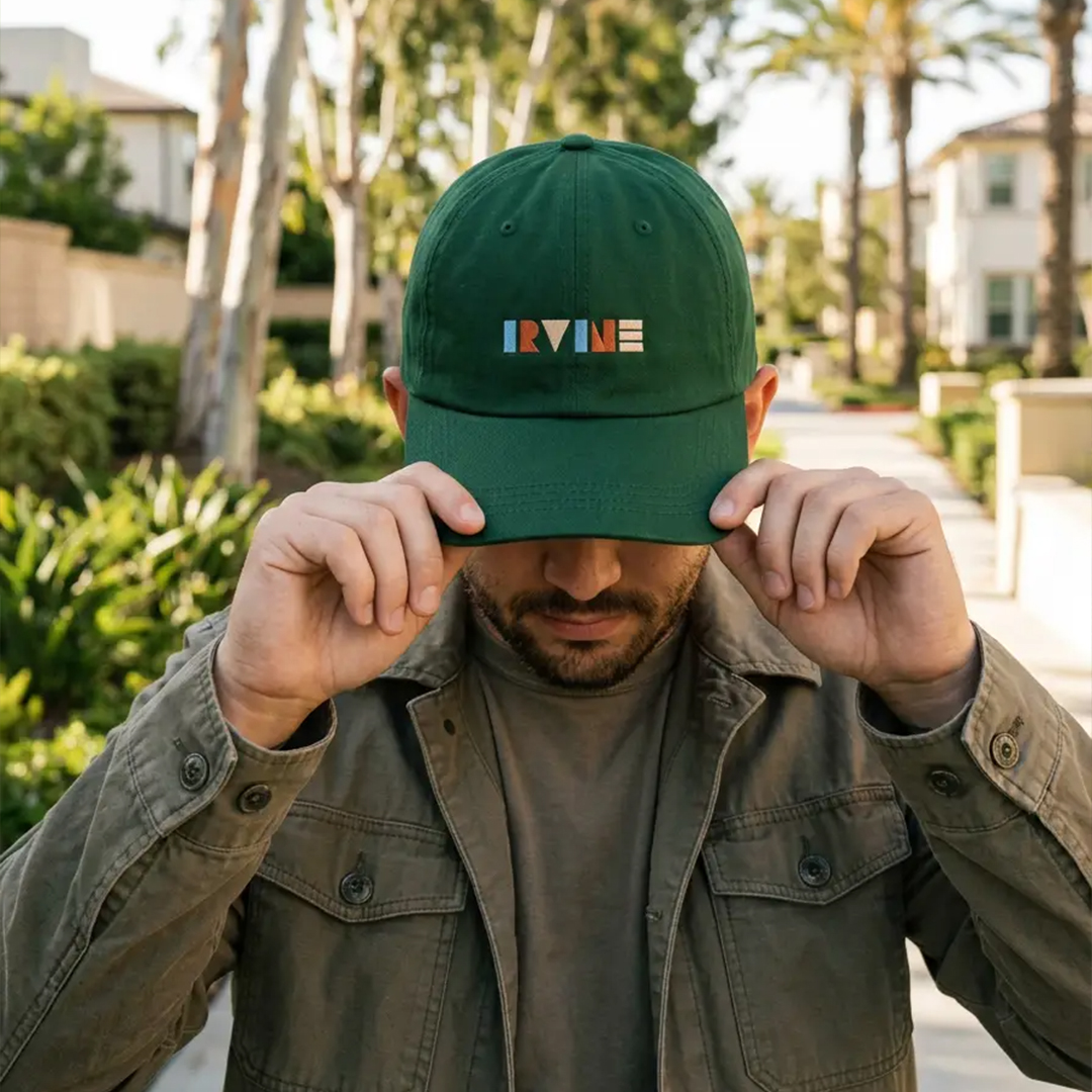
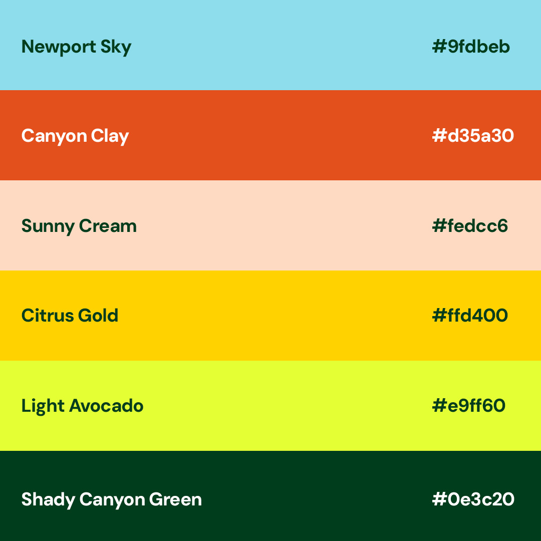
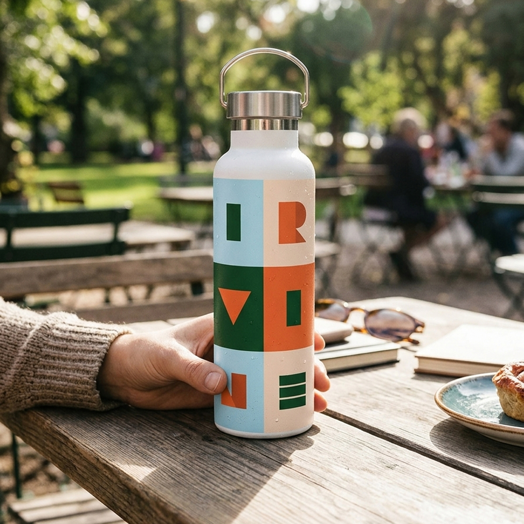
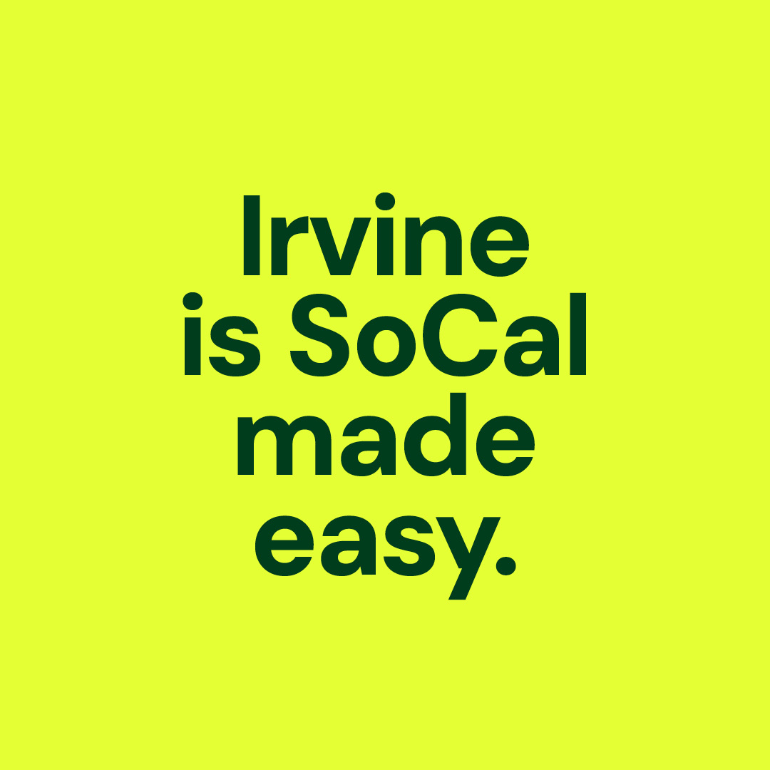
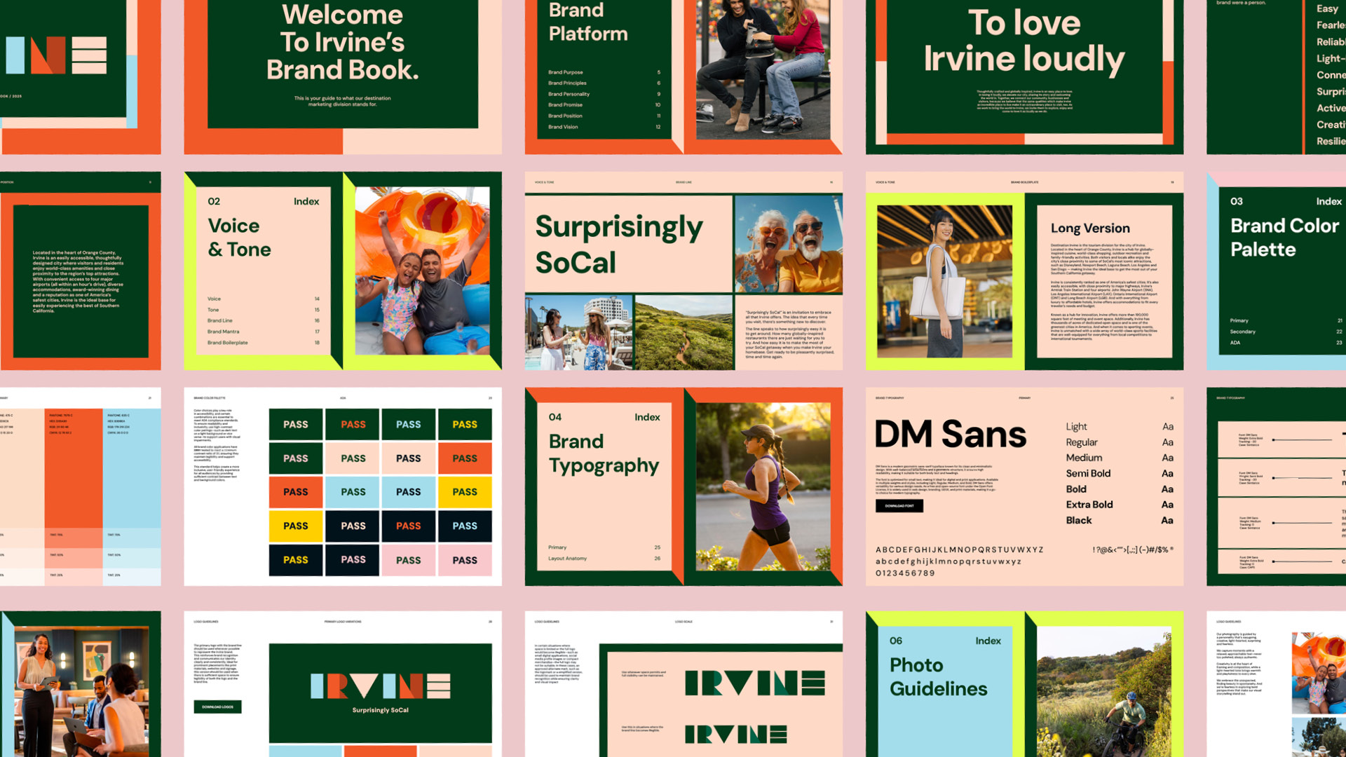
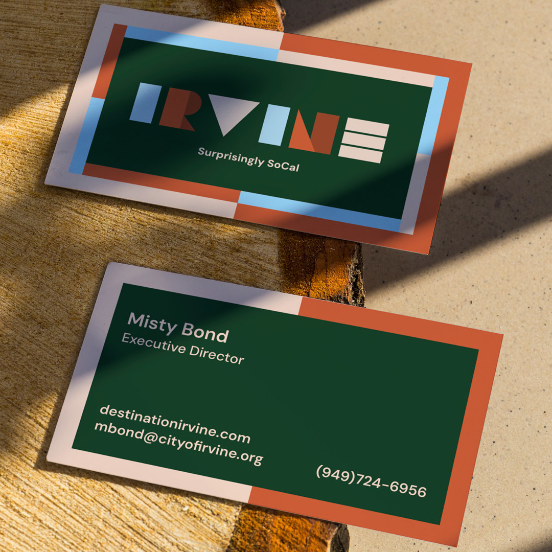
Irvine, California reimagined its identity to overcome its perception as a “cookie-cutter” destination and differentiate itself within the competitive Southern California landscape. The refreshed visual system embraced an easy, creative, and fearless personality, using everyday shapes and patterns—each tied to a brand trait—to form a modular design language that literally spells “Irvine.”
This new identity launched with the “flipside” campaign, highlighting how business and sports travelers visiting for obligation would discover a vibrant, unexpected city with far more to offer.
- Client
- Irvine
- Year
- 2024
- Role
- Art Director, Designer
- Industry
- Destination Marketing
- Services
- Brand Identity, Campaign Development
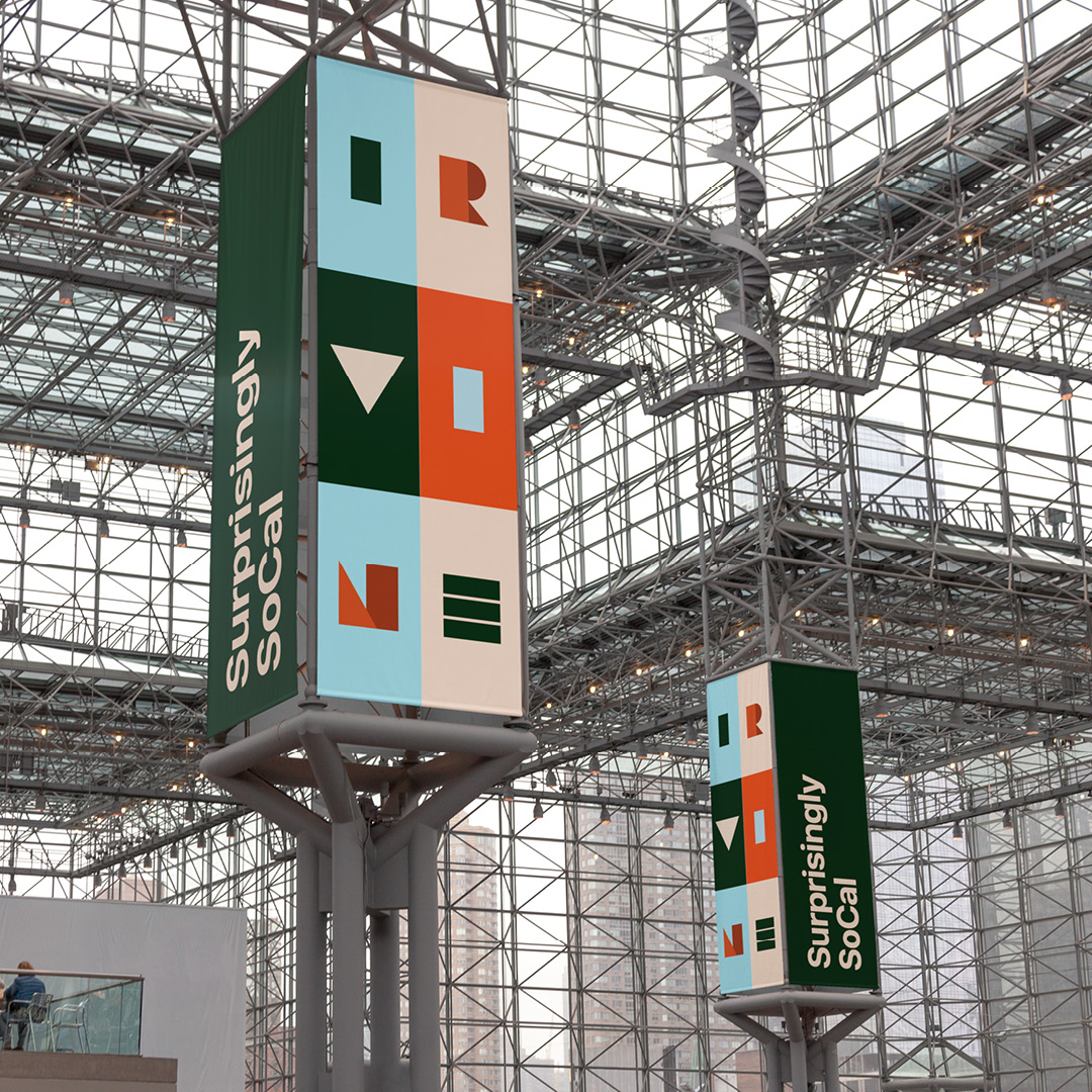
Campaign Launch
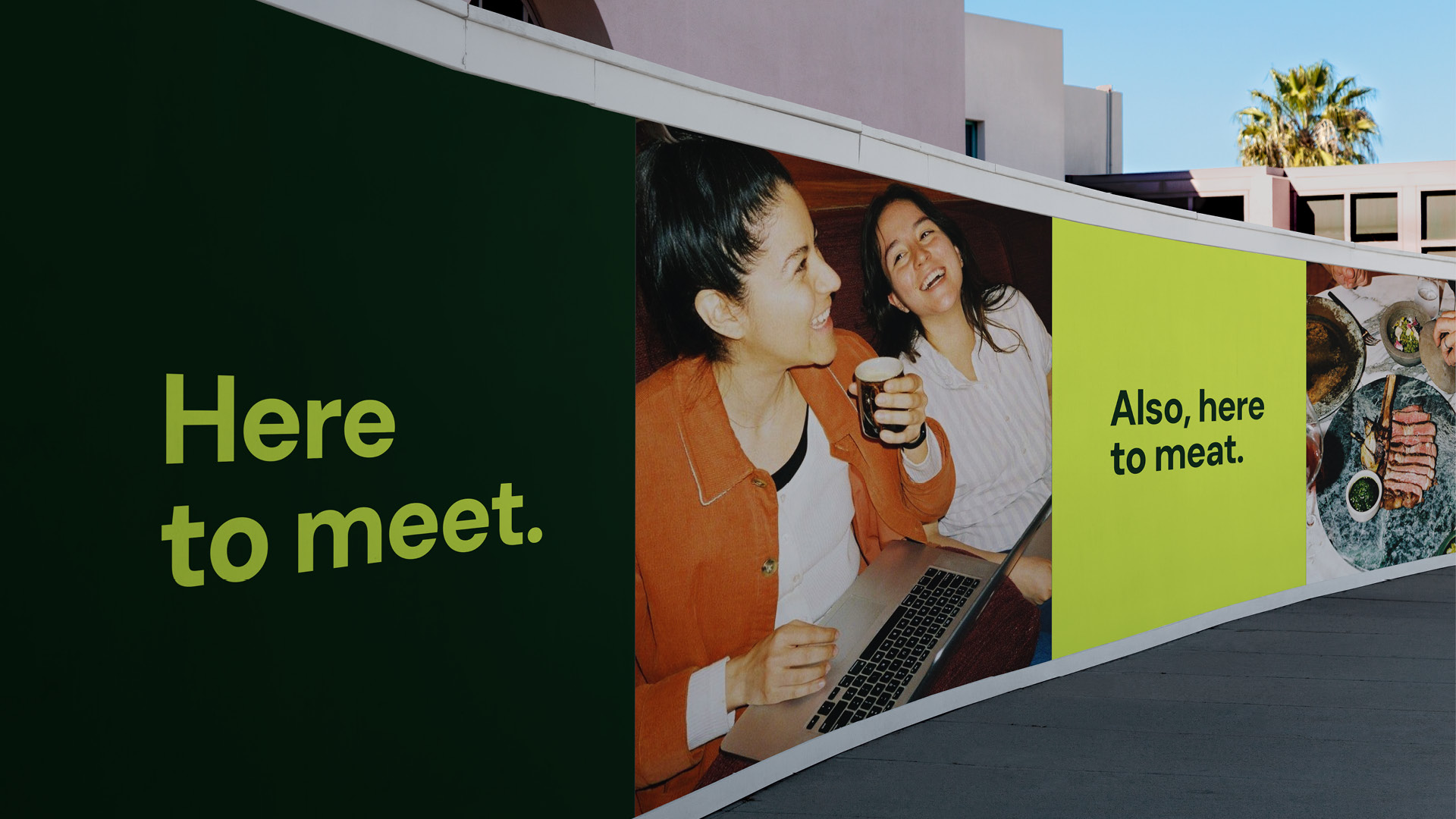
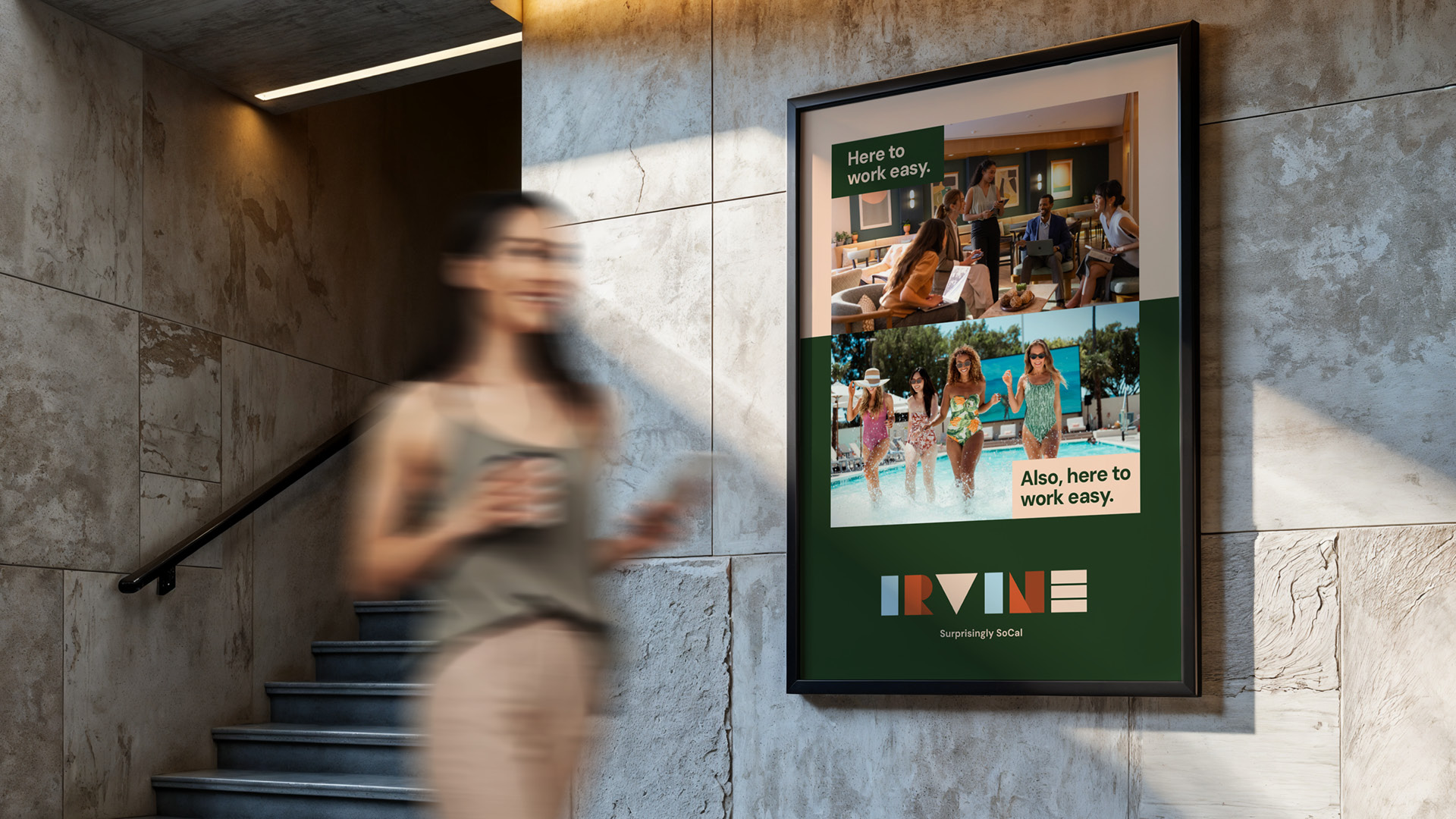
The campaign assets were built around a clever dual-meaning concept that paired two contrasting ideas to highlight Irvine’s “flipside” appeal. Each execution positioned a traveler’s obligation—such as business meetings or sports tournaments—against an unexpected and rewarding aspect of the destination.
By using wordplay to create double meanings, the creative emphasized that while visitors may come to Irvine for one reason, they quickly discover something entirely different and pleasantly surprising. This approach not only reinforced the city’s new personality but also delivered a memorable, scalable system that showcased Irvine as a place where obligation transforms into opportunity.
Swag
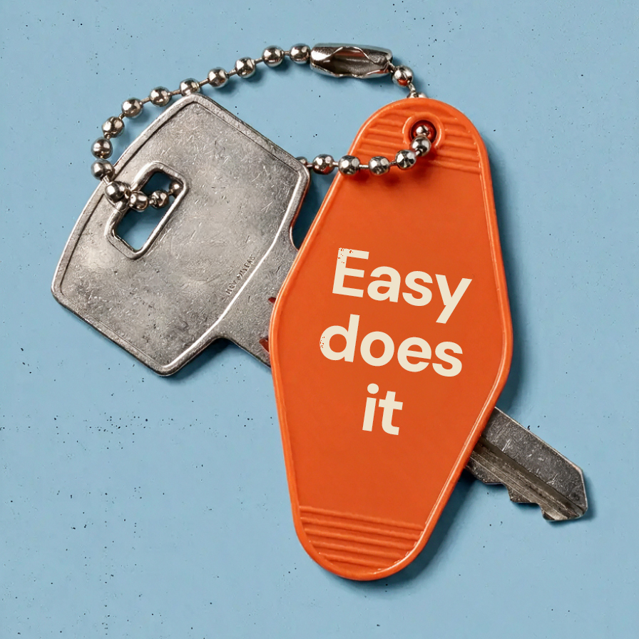
Conference materials and swag were designed to stand out and embody Irvine’s refreshed personality in simple, memorable ways. Bold colors, distinctive shapes, and playful messaging helped the items cut through busy conference environments, while thoughtful design made them pieces people genuinely wanted to keep. Each item acted as a small, impactful touchpoint that reinforced Irvine’s creative, unexpected identity.